Shiny App: https://rconnect.bucknell.edu/content/d99a79a6-2b68-42fa-a948-a58fbe07b00b
 Affect of Confidence Level on
Confidence Intervals
Affect of Confidence Level on
Confidence Intervals
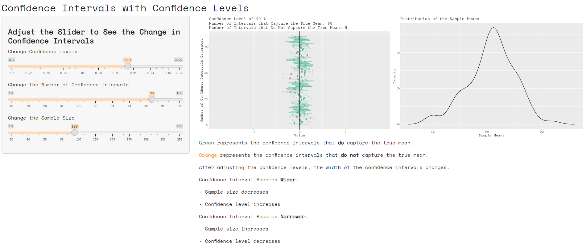
This interactive visualization made through Shiny allows the user to change certain variables that will affect the two graphs on the right side of the page. Using the slider, the user can alter the confidence level, the number of intervals, and the sample size and see how the graphs change. A decrease in sample size will widen the intervals, as will an increase in confidence level. The opposite will make the intervals more narrow.
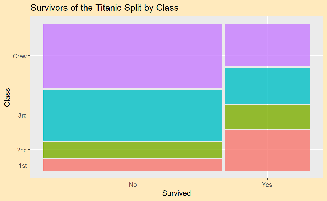
Survivors of the Titanic Split by Class
This mosaic plot measures the “titanic” data set, a set that lists traits about the people on the Titanic when it sunk in 1912. In this case, the plot shown splits the data according to passenger class (1st, 2nd, 3rd, Crew) and whether the person survived. The mosaic plot shows the disparity between classes of who survived and who did not. For instance, very few 1st and 2nd class people died, but many in the 3rd class and the crew died.
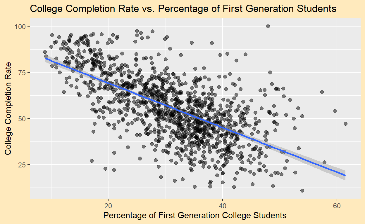
College Completion Rate vs. Percentage of First Generation Students
This graph uses the data set “College Scores” to show the relationship between a college’s percentage of first-generation students and its completion rate. “College Scores” is a data set housing information on over 6,000 colleges. For this scatterplot, the data set was cleaned to eliminate any schools whose data contained NA’s. As a result, this graph has a little over 1,100 data points. The plot focuses on the percentage of first-generation college students and the completion rate for each school. The scatterplot shows that there is a moderate negative linear correlation between first generation college students and college completion rate. In other words, it usually follows that more first-generation college students yields a lower college completion rate.
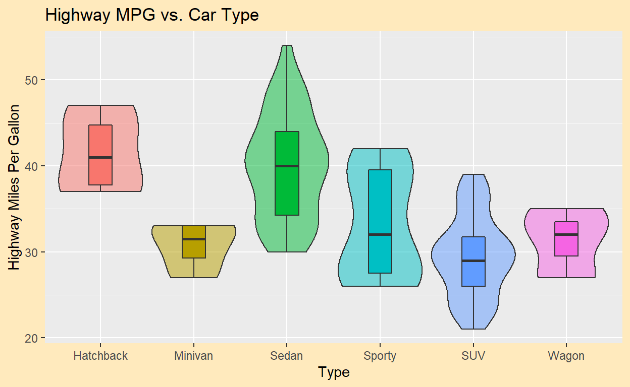
Highway Miles Per Gallon vs. Car Type
This violin boxplot was constructed using the data set “Cars2020”. “Cars2020” contains information on 110 different types of cars, such as make, model, seating, and weight, among others. In this case, the relationship between type of car and highway miles per gallon was examined. The violin boxplot shows how types of cars differ in their highway MPGs. For example, Hatchbacks typically have a pretty high highway MPG, while Minivans usually have low MPGs. In fact, in this data set, every Hatchback has a greater highway MPG than even the Minivan with the highest MPG. Sedans and SUVs have a wide range of highway MPGs.